“Stainless steel, as a material, comes with aesthetic sensibilities unlike any other.”

Architect Aarushi Kalra takes us through the journey of crafting spaces that tell stories—where curiosity meets creativity in every design, and exploring stainless steel’s artistic edge to shape bold, immersive environments.
Tell us about your journey in the field of architecture and interior design.
Having grown in a family of architects and designers, my calling into the field came from the inspirations that I found in my impromptu visits to our studio. From being an architecture undergrad to being a postgrad in design, my transition felt natural, almost liberating in a way. Moving fluidly between multiple design arenas has only given me a chance to challenge and immerse the viewers into provocative, layered and experimental environments that explore the art of storytelling through a multi-layered design language.
What is your signature design aesthetic and philosophy?
To me, designing is all about have fun with the ideas—some old, some new, but definitely something untold. It is about unfolding stories and ideas that create a sense of engagement with the people. I have always wanted to create spaces that inspire and excite, bringing us closer to connect with them and open up a narrative that they can actually be a part of.
I like my designs to be curious, introspective and inquisitive; something that takes a dip into what goes beyond the spatial experience.
In short, I love to give a small ‘ ! ’ moment through my designs.
What was the brief given to you for the RK Opticians project?
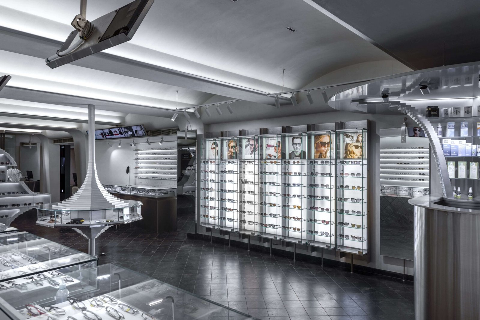
RK opticians at Bopal spoke for the post-covid times when we all weren’t sure where retail was headed for, as a space. It prompted us with one question – “In a time where everyone got comfortable shopping from the comfort of their homes, why come out to a physical space to shop?” The space was thus designed to be an immersive environment that gave more than just a transactional experience to become of utmost importance. Through such a space, the brand had a story to tell, of what the future has on hold—in a playful and edgy narrative that reflected its readiness to adapt and evolve.
How did you go about creating the design and deciding upon the elements and materials to be used?
The brand and its heritage called for a fresh design language that reassured its connection to its customers—both old and new. The call for timelessness made way for a moodboard centered around silver–the colour that takes us back and forth the timeline. From being a much-celebrated precious metal, to dictating fashion in Paco Rabanne’s metal dress, to setting the chrome details of the space suits, the color touches upon everything bold and beautiful. Playing along the extraterrestrial silhouettes in clear glass strike the perfect contrast on the black granite of the floors and the rest of the monotone canvas, to create something out of the world, literally.
While the nostalgia is intrinsic with the palette, the way people relate with it is left open-ended. The design itself is a combination of things that have no defined meaning–what looks like a ‘stupa’ to one person looks like a ‘UFO’ to another. These interpretations change from person to person based on their individual experience–and the endlessless possibilities of these interpretations come to give the ‘aha’ moment to the project.
What inspired you to use stainless steel in this project? What is the functional use and aesthetic appeal of this element?
For a space that articulated its experience through the sculptural installations, stainless steel—in all of its forms—came as an unquestionable choice. The edgy futuristic context called for direct implementation of this highly technical material, that has been adapted logically, statistically and aesthetically, in ways more than one. The sharp profiles of the hexagon displays are softened by the vaulted ceiling fabric, seamlessly, as the material’s sheen takes over its monotony, to give us something interesting to look at.
The clean-lined cuts, the smooth bends, the sturdy blocks and the sleek strips altogether speak for the structural adaptations of stainless steel to draw multiple purposes out of it. While it is predominantly pre-fabricated with structurally sound systems, the possibility of handcrafted, textural variations make it open to creativity–it is the surface that brings the feeling.
With stainless steel—there is always more than one way to make something exist.
How often do you use stainless steel in your work? Why?
The chrome aesthetic along with its very practical fabrications, make it ideal for contemporary designs that are ready to strip off the concealing layers and embrace the original skin of the materials–their aesthetic and strength, both. From exposed ceilings to wireframe shelving, countertops and partition systems, the material has stood straightforward and bold, bringing all the structural BTS to the actual forefront. Its logical and technical implications make it a complete product, that also keeps the project spends under bounds.
What is lesser known is the vibe and the sense of grandeur that it instills–the colour and textural variations make it interesting and experimental, bringing an artistic side to its otherwise mechanical look and feel. The art begins where its sculptural qualities come to coexist with its technicalities.
To me, using stainless steel simply gives us an opportunity to challenge and celebrate the limitations, all at the same time.
Do you recommend stainless steel as a material to interior designers?
Stainless steel speaks for past and present alike—it talks about the nostalgia of industrial styles and the futurism of the space age, all at the same time. Interior designers can leverage its timelessness and draw new meanings out of it to create a space that has more than one side to its story.
What are the shortcomings of using stainless steel?
Stainless steel, as a material, comes with aesthetic sensibilities unlike any other.
It instills a sense of industrial design that is brutal and somewhat cold, as a material. However, the possibilities that exhibits by itself are so many. It’s just a matter of finding the right balance to create the right ambience. For example, if the space had to feel intimate and warm, then one might want to consider how and in what proportion the material is used.
When we learn to play with its quality and make it emote and create a sense of intimacy that goes hand-in-hand with the other materials, stainless steel will surely come to surprise us!


